Based in Toronto, MakerKids teaches kids STEM skills through a variety of programs, including after-school classes, summer camps, and private classes. They have 2 locations in the Toronto area, and further categorize their classes by subject (ex: coding) and grade level. Because of the diversity of their offerings and the use of an external registration site, MakerKids had a relatively high bounce rate for the registration process, and instead took a large portion of registrations through the phone or in-person.
Our goal for this project was to improve the user experience for the registration process on the MakerKid's website. Specifically, we aimed to reorganize the content, create a step-by-step journey for the user, improve content visibility, and utilize a design that was consistent with the rest of the website.
We started by conducting best practice research and assessing competitors' tactics. Based on this research, we developed 8 key best practices that we wanted to implement in the redesign. These requirements were:
We also conducted a heuristic analysis of the original website to expose any significant flaws. Moving forward, we created our first wireframe that utilized the 8 best practices, addressed current flaws, and was consistent with the MakerKids design.
Old prototype
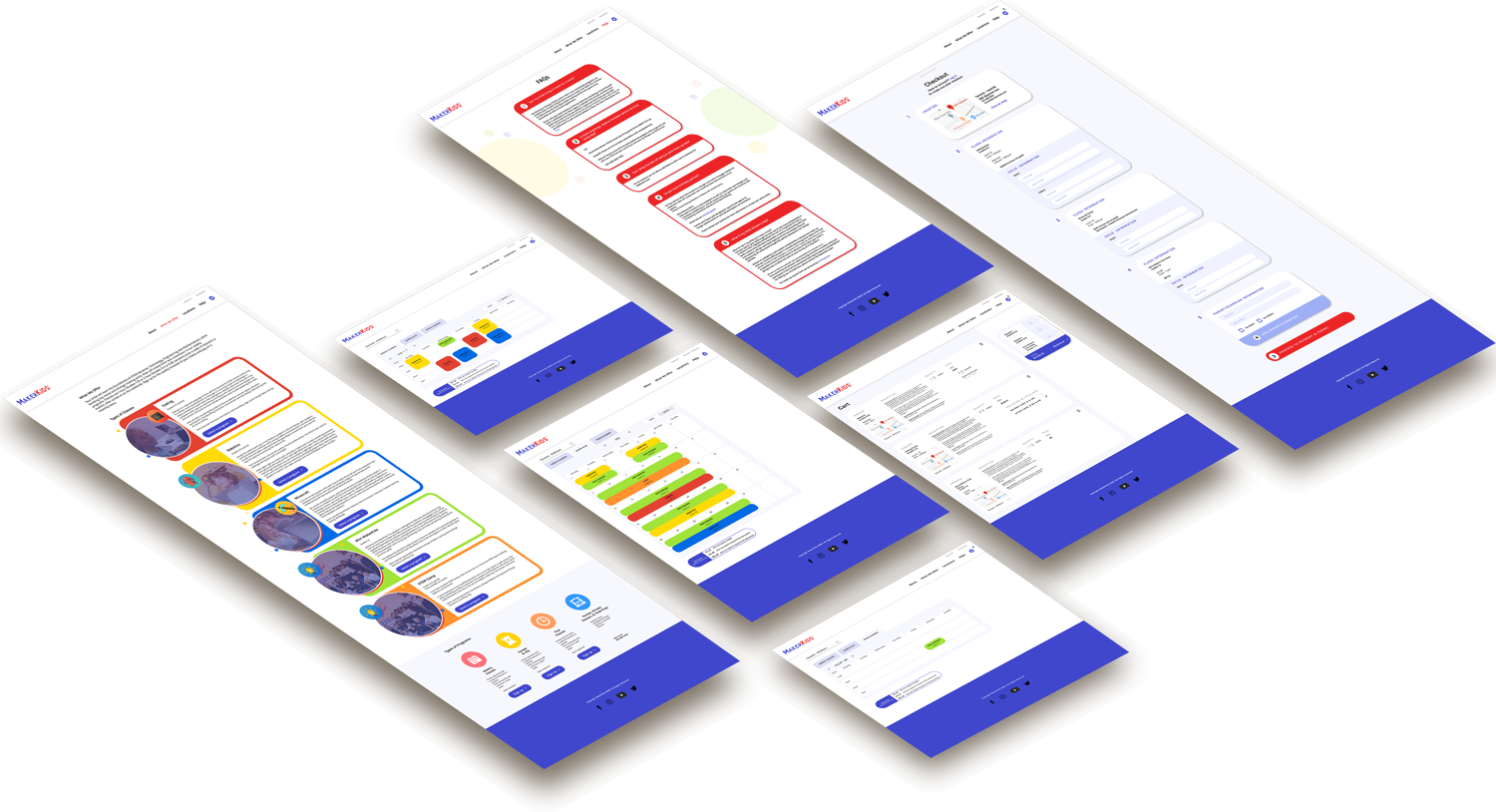
After our prototype was in place, we conducted usability tests and interviews with a handful of subjects. Users were asked to complete tasks such as add multiple classes to the cart, change the number of kids registering for a class, and navigate to the checkout. For the most part, test subjects struggled with small issues that were due to the limitations of the program we were using. After tweaks were made, we conducted another round of tests using eye-tracking software. These were helpful because they confirmed that the changes we had made were effective. The final prototype is below.
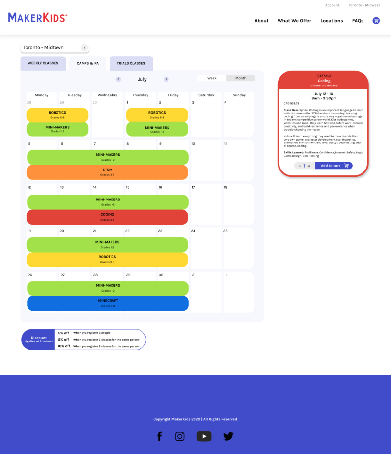
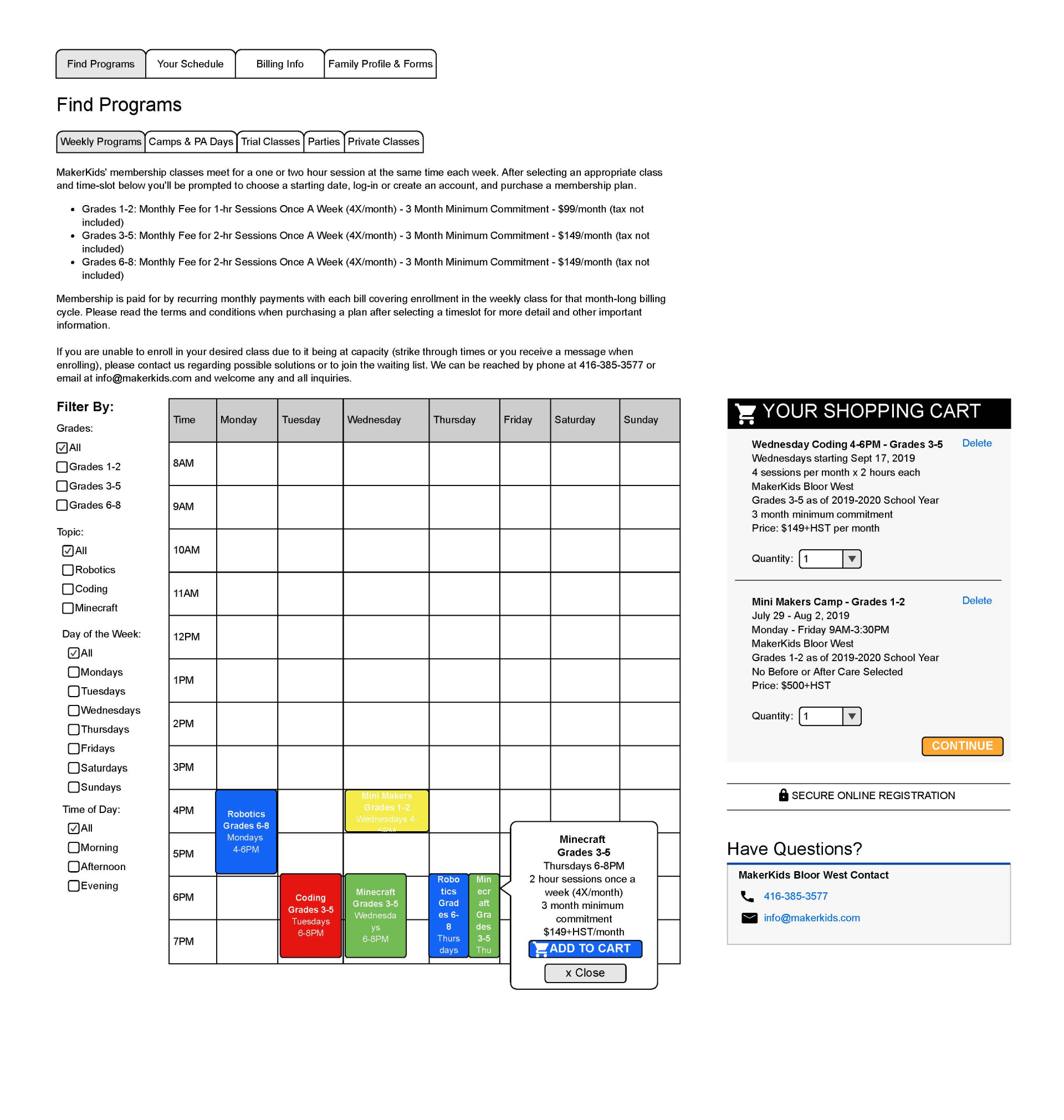
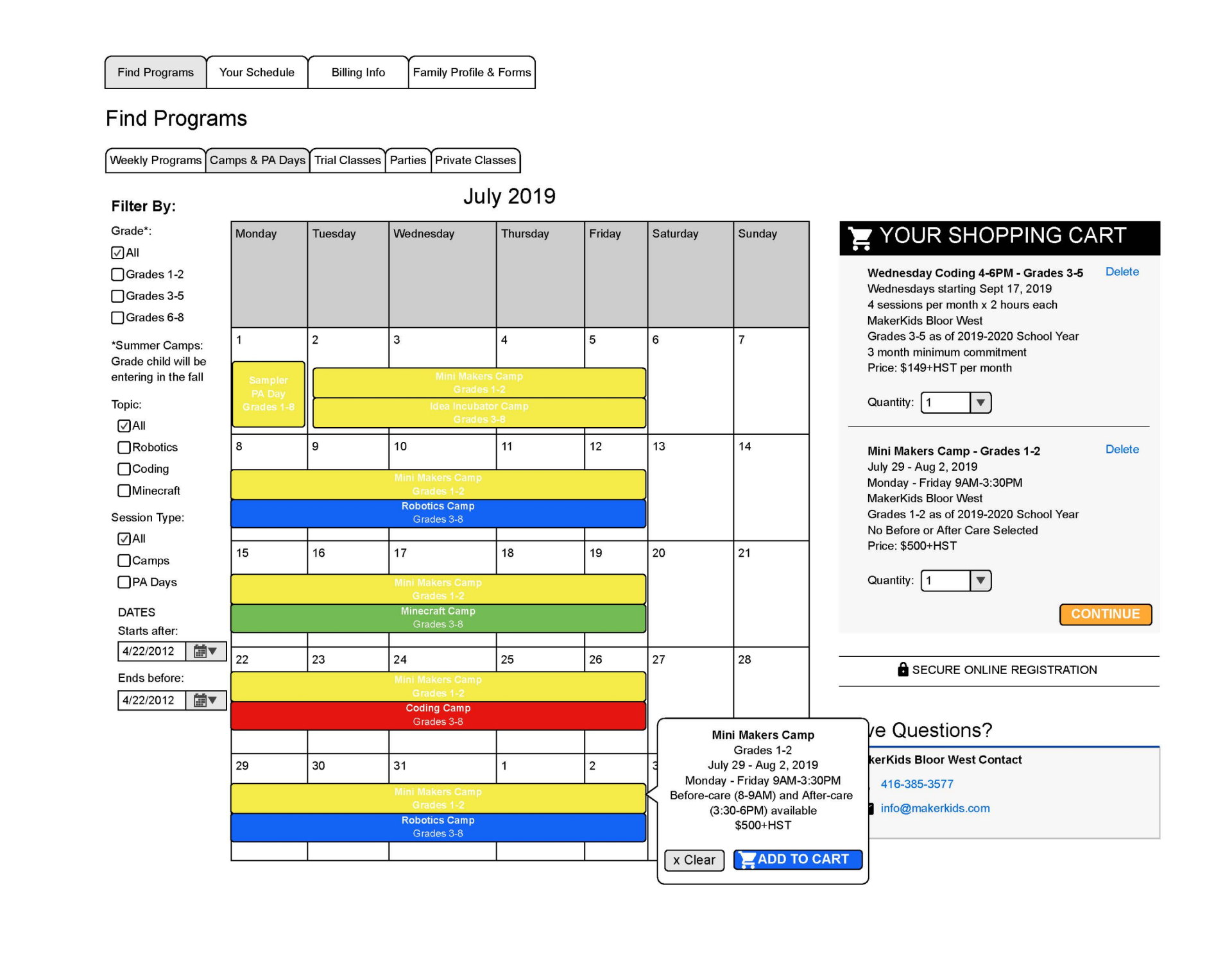
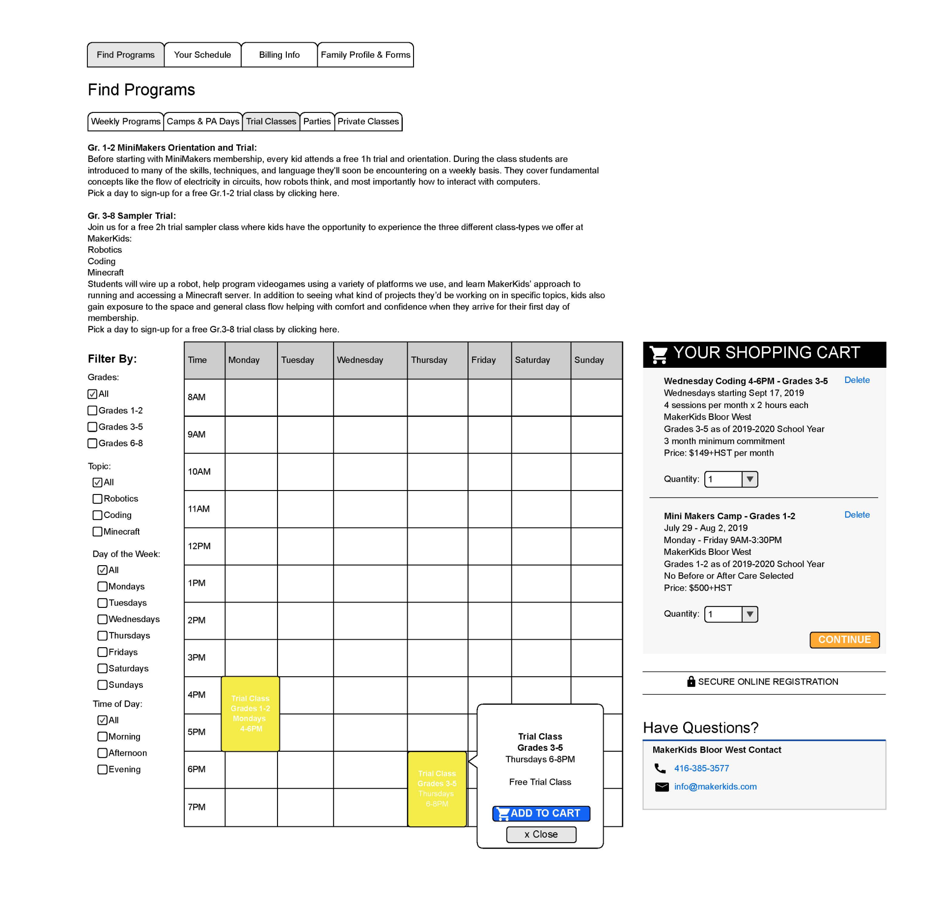
The first problem we encountered was how to organize all of the information when a user is signing up for a program. Our client wanted the programs organized by the type of program, so we displayed the program options on a calendar, color-coded by subject, with the additional types of programs in adjacent tabs. When the user clicks on a program, it pulls up a box on the right hand side with additional details, as well as the option to add the program to your cart. This way, information is hidden until the user wants to view it.
This page also includes the option to change which location you're viewing, since programs vary by location. We also included the option to toggle between week view and month view.
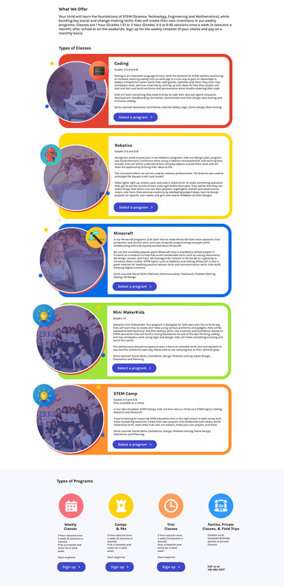
The second problem we had to address was how a user arrived at the scheduling page. In order to solve this, we realized we would have to take a step back in the user journey and build a page that funneled the user through information. This page would serve as a bridge from the current site to the new registration site, and present information in a very clean, digestible way.
First, users read an overview of each subject offering. Originally, this information was included on the scheduling, which made it very text heavy. If they click on “sign-up”, it will scroll the user down to the ‘Types of Programs' section for their next step; if not, they will scroll down to this section on their own. One a user selects a type of program, a modal pops up that prompts the user to select a location. Once all of these selections have been made, the user is sent to the scheduling page.
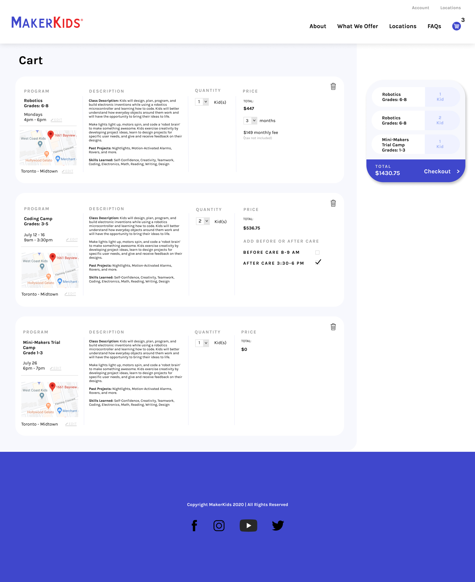
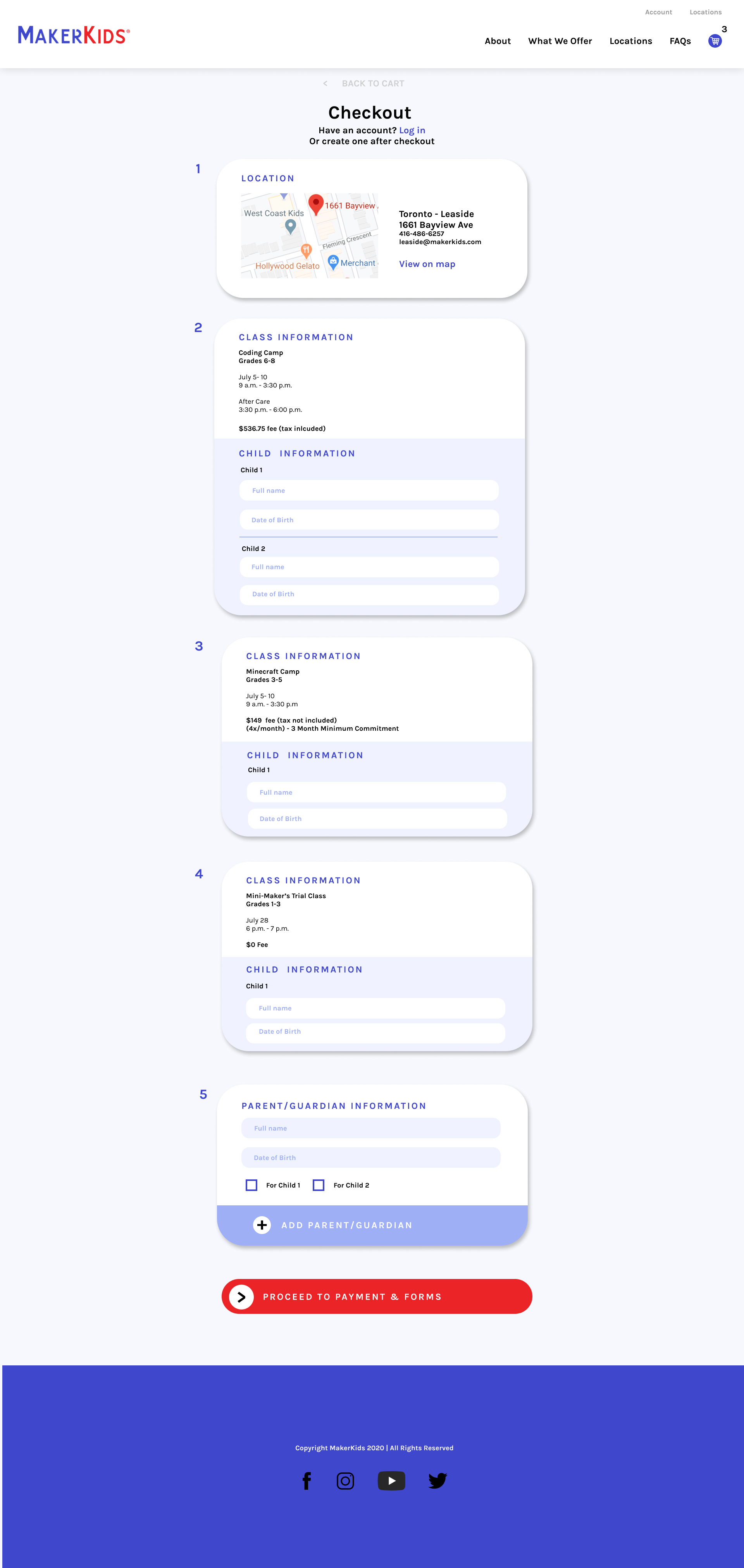
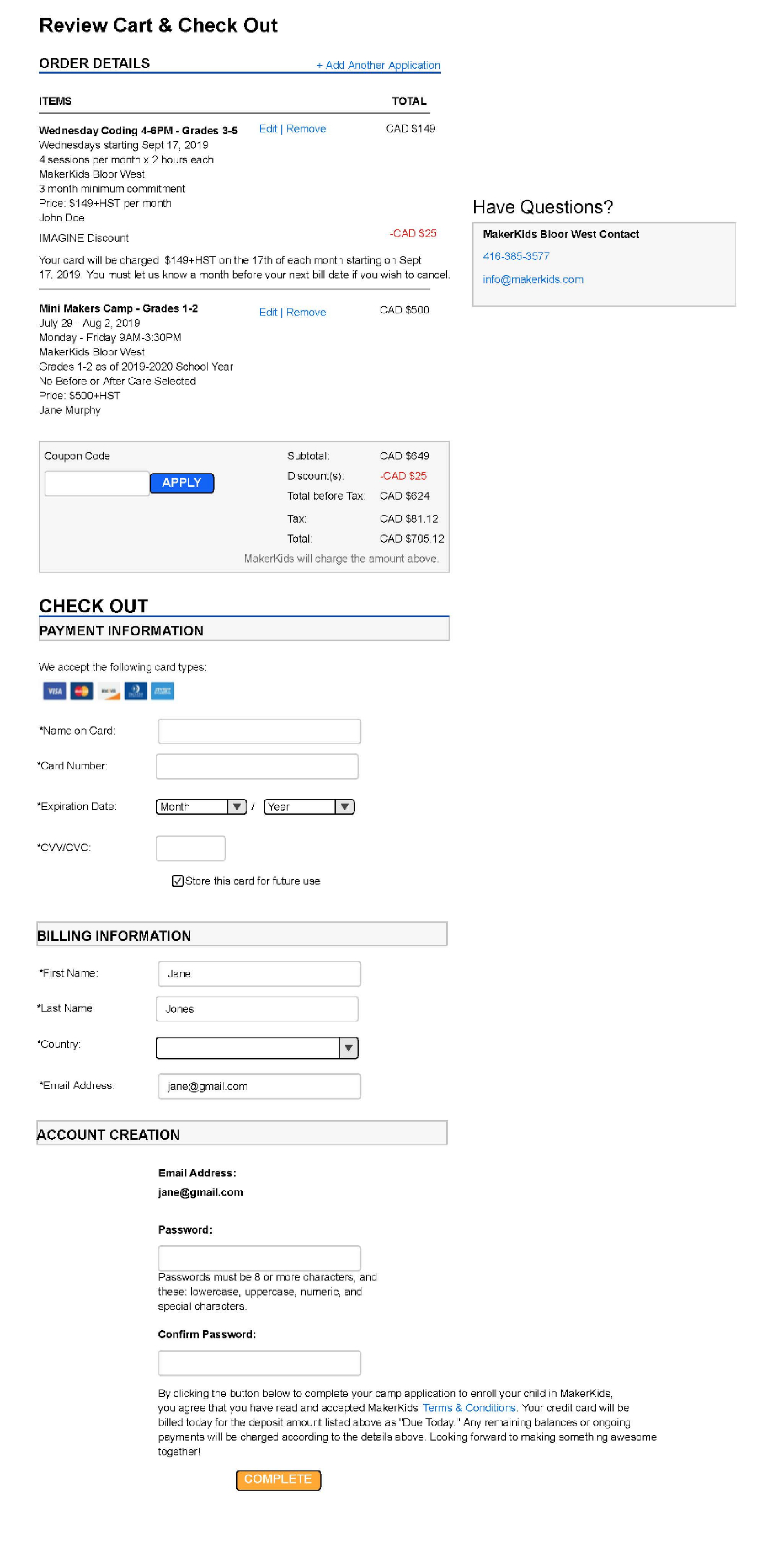
The third and most important aspect we addressed in this project was the final registration and checkout process. Based on our research, we decided to first include a Cart View page, where the user can make changes to their program selections, such as registering additional kids, adding aftercare, and changing the location. They can also view the final price. This page is the most information dense page we built because we wanted to maintain transparency with the customer and reduce confusion; this ensures that the checkout is a more streamlined process and that the user is less likely to bounce.
The final checkout page is where all of our 8 best practices come into play, such as including defaults, organizing information in chunks from easiest to hardest, clearly outlining the steps, and utilizing a streamlined one-column layout. We needed to design it with the possibility that the user could be registering for multiple classes, with multiple children, and multiple parents/guardians. To accommodate for this, we grouped the blocks by classes, made the background of less important sections a darker color, and added options that expand only if the user clicks on it. Most of the information on this page is reflective of the Cart View, and offers a simple review and confirmation for the user before moving on to the payment method.